Who are King & Tuke?
King & Tuke is a London-based design agency, and the parent company of SMLWRLD. When we started looking at the original branding of SmallWorlders, my partner Simon Tuke and I both felt it was slightly outdated.
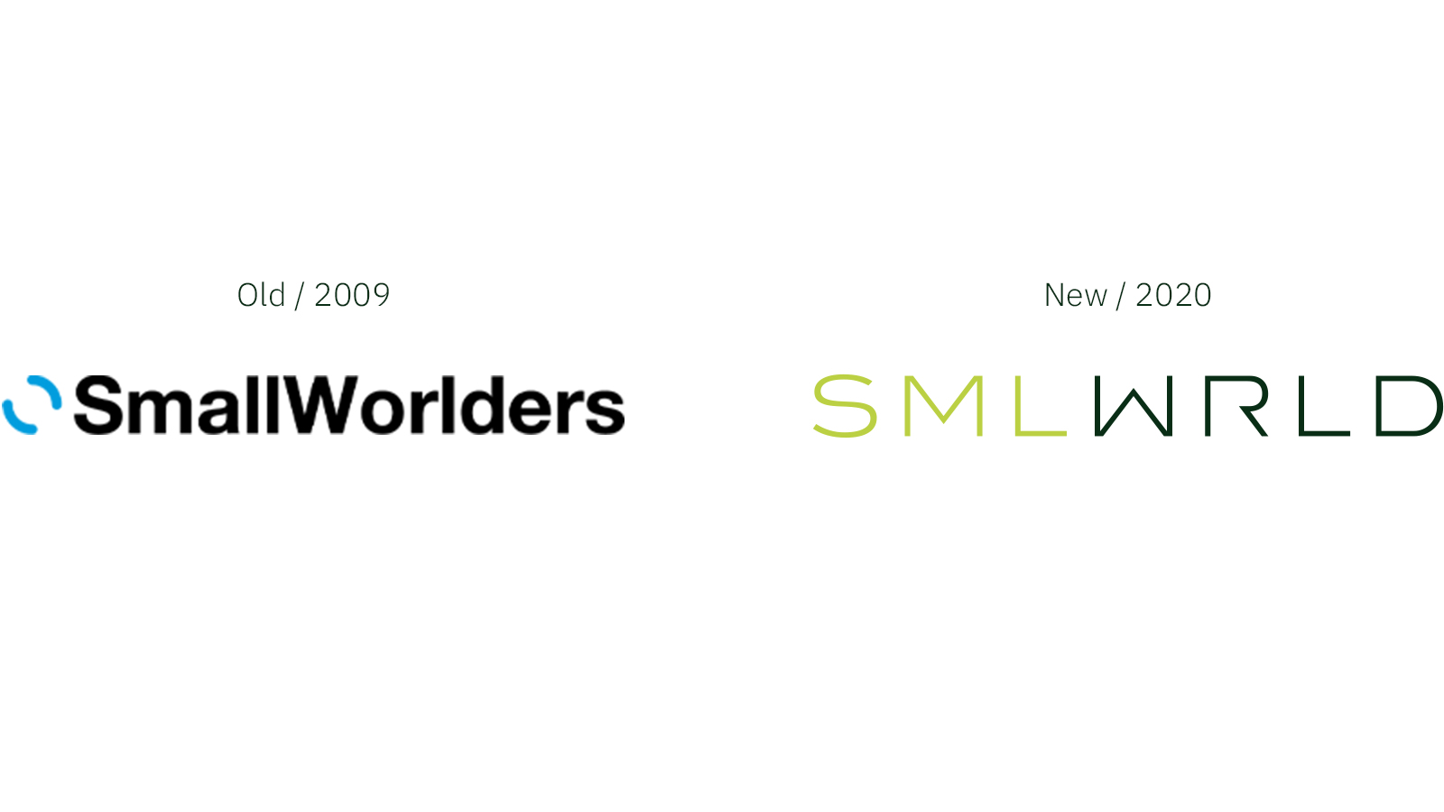
The original logo was a generic black and blue, which is common amongst tech companies, and it didn’t particularly convey the identity of the brand.
We also felt that the name ‘SmallWorlders’ implied a sense of being a small, insular group of people, as opposed to a large entity capable of providing software to a broad international platform.
In order to reflect its technological offering, the brand needed to be modernised. However, we didn’t want to upset the existing clientele by completely changing the brand, so we waited a year before making any changes.
 What’s in a name? Saying less, meaning more
We began the rebranding process with a change of name. Initially, we worked with Managing Director Dan Jones to find names that derived from Sandbox, SMLWRLD’s pre- existing platform. However, it proved a struggle to find anything along those lines that fitted with our new vision for the brand.
Instead, we decided to fine-tune ‘SmallWorlders’, which meant that the identity already familiar to our existing clients could be maintained. We were keeping the continuity of the brand without throwing out the brand equity. By refreshing the name, instead of losing the equity, we were moving it on.
The original name was about working closely together as part of a team, which made sense for an intranet company, but it didn’t tell us anything about the brand that would stand out.
We wanted a name and logo that said more about us, and our journey towards becoming a carbon-neutral company. By scaling down ‘worlders’ to ‘world’ and removing the vowels, we were now telling a story about reducing waste and bringing people together.
Creating a carbon-neutral brand
As Creative Director, I usually oversee our projects, but with this rebranding I took a more hands-on approach. We needed to highlight our carbon-neutral products, whilst avoiding clichés such as plants, animals or the planet. We were never particularly happy with the original colours, so when creating the new palette, we wanted to start afresh.
We alighted on a balance between rich greens and bold blacks, accentuated by a hint of orange. These new colours elevate SMLWRLD beyond its competitors in the tech industry, and reinforce the focus on environmentally friendly practices.
We used the same typeface that we use for King & Tuke, but with a bolder R to give a techier look, whilst creating a sense of family between the two brands. We also turned the M upside down to create our W, which further represents the reduction of waste and instils a sense of balance and synergy.
Sharing the vision
Our new logo encourages the viewer to be active in determining meaning, enabling it to move beyond its two-dimensional predecessor, and convey the dynamic ethos of the brand.
When designing a new brand, it’s difficult not to be fearful of negative comments, as people do not typically like change, but the new branding was received positively. The SMLWRLD team are very forward-thinking and progressive, so were highly receptive when presented with the new look, and were in fact extremely congratulatory.
An internal audience is every bit as important as an external audience, because if staff don’t believe in a brand, they cannot promote it to its full potential.
Once we knew that the SMLWRLD team were behind the new brand, we handed it over to Cass and Saleem, our designers, to bring it to life on the SMLWRLD website and, of course, in our intranets.
Jason King
Jason started out at Ogilvy & Mather Direct, becoming one of the most award-winning art directors in Direct Marketing. He then moved above the line with the original creative hotshop, CDP, where he became Creative Director on the Historic Royal Palaces account, creating a highly successful poster, press and radio campaign for the Tower of London and Hampton Court Palace. In 1999 he joined Simon Tuke as a Creative Group Head at McCann-Erickson, the world's largest advertising agency network. His art direction has won him awards at Cannes, D&AD, Campaign and DMA for brands like IBM, the Royal Mail and Microsoft. The campaign he created with Simon for QBE Insurance won two Golds at the Money Marketing Awards, for Best Business Press Advertisement and Best Business Press Campaign. He has also, amongst other things, helped London Transport Museum achieve record visitor numbers through a poster, press and radio campaign, launched two high end bank accounts for Santander Private Banking, and created the RAF Museum First World War in the Air campaign.